LaunchDS


Tokenized Design at Scale
The cleanest token-first design system for Figma. Build interfaces with LaunchDS tokens and components to mix and match themes, devices, and brand identities in just a few clicks—while maintaining perfect harmony and consistency. Includes production-ready sections for Figma Sites.
This website is built with LaunchDS & Figma Sites


After working with countless design systems over the years, I distilled my experience into LaunchDS in 2025. It acts as a curated 'best-of' foundation and the ideal starting point for my client projects. The system is not overloaded but includes all relevant components. Every property is controlled by a logical variable architecture, allowing me to easily showcase every screen across different device sizes, themes, and design directions. This creates a workflow flexibility previously unseen in Figma.

David Bühn
Creator of LaunchDS
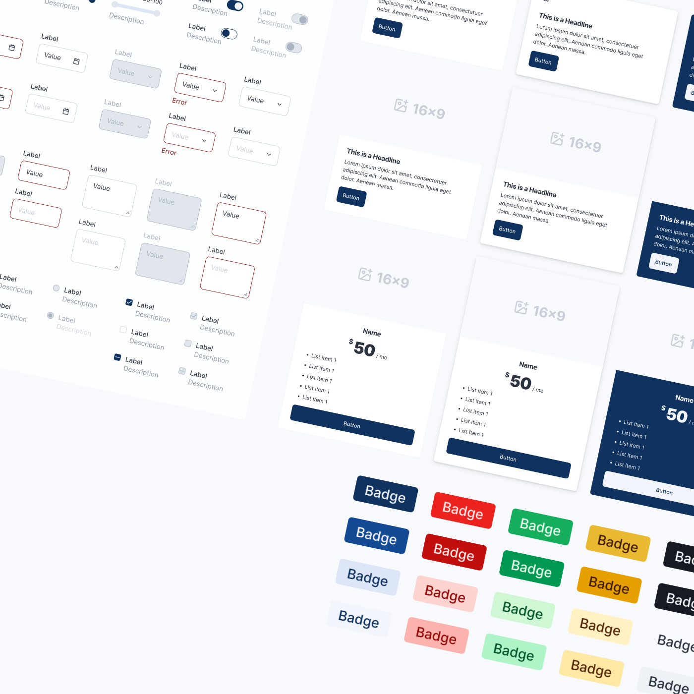

Components
Essentials for Your Vision
The Core of Your UI. A curated library of versatile components—buttons, inputs, menus, and more. Optimized for speed and consistent user experience.
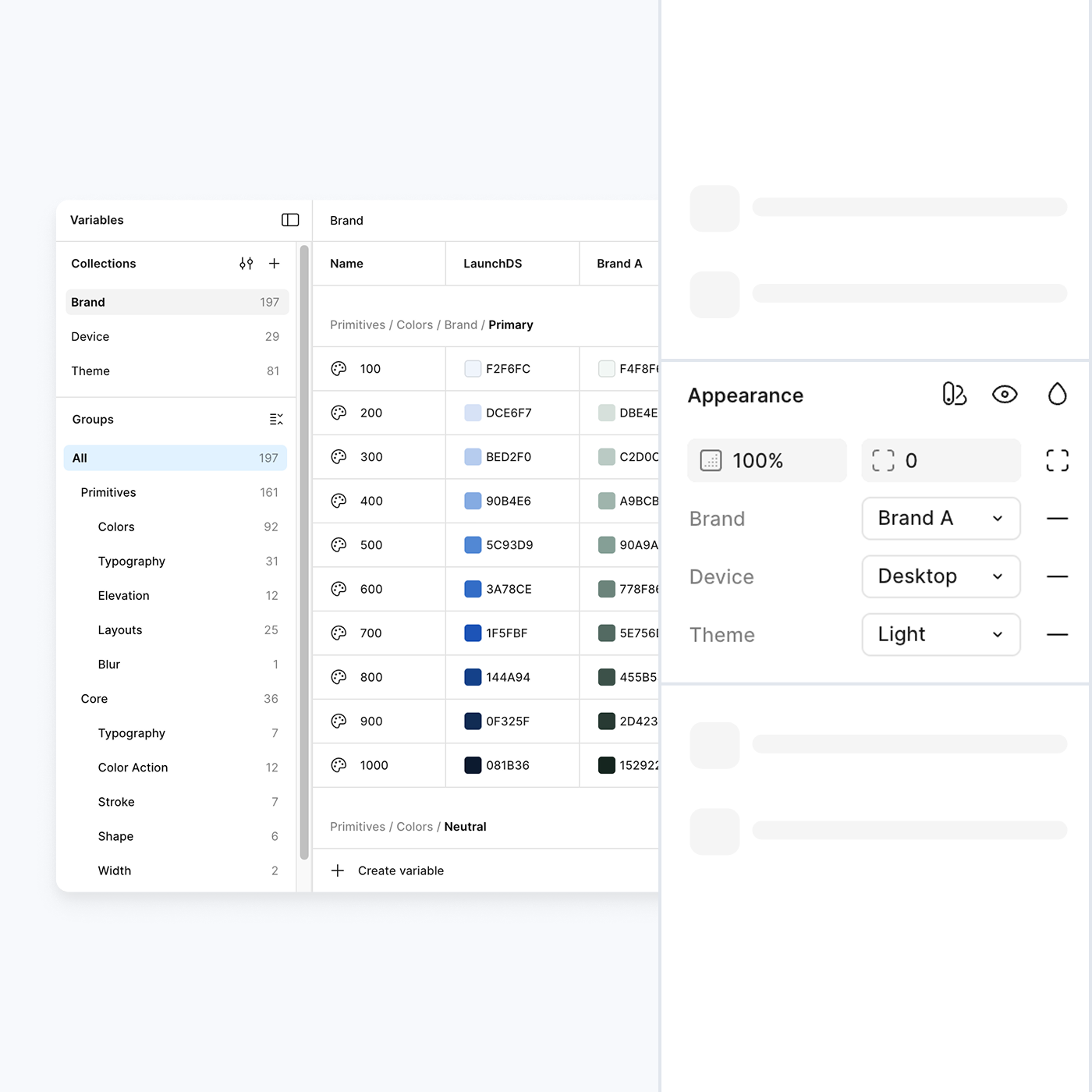

Tokens
Multi-...Brand
...Device...Theme
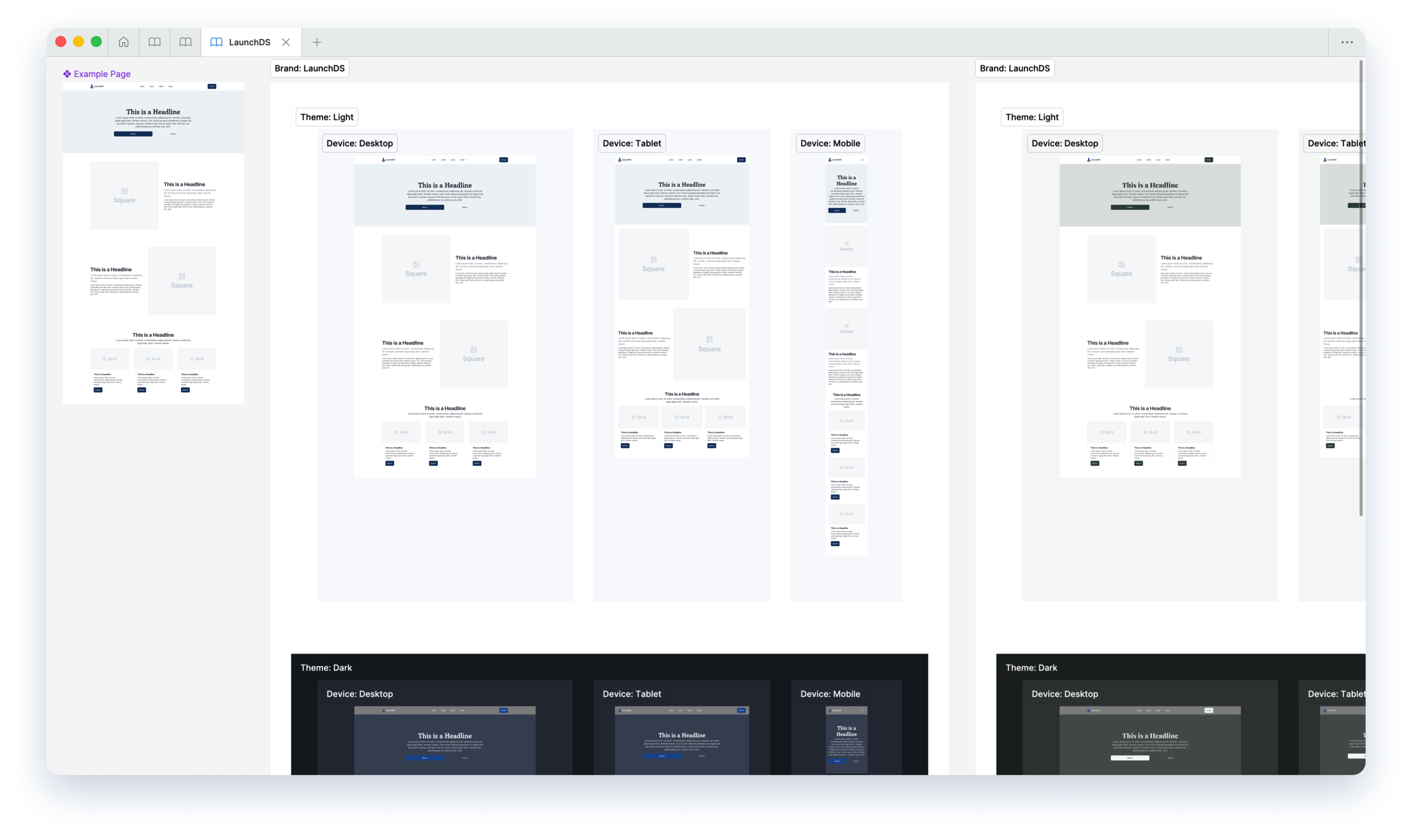
One System, Infinite Styles. Setup your Primitives once and effortlessly switch between brands, devices, and themes. Pure logic, no manual overrides.
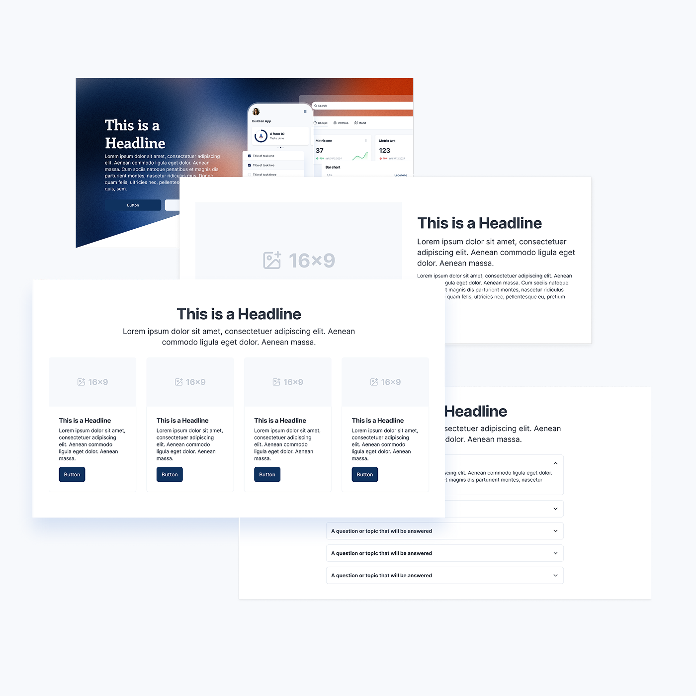

Sections
Build Stunning Websites in Minutes
Rapid Prototyping to Production. A collection of customizable sections—from Hero modules to FAQ cards. Fully responsive and ready for Figma Sites.
How it works
Token Architecture
This is the nerd part. We don't use hardcoded values. Every component is built on LaunchDS Core, Device, and Theme tokens that alias the raw Primitives directly.
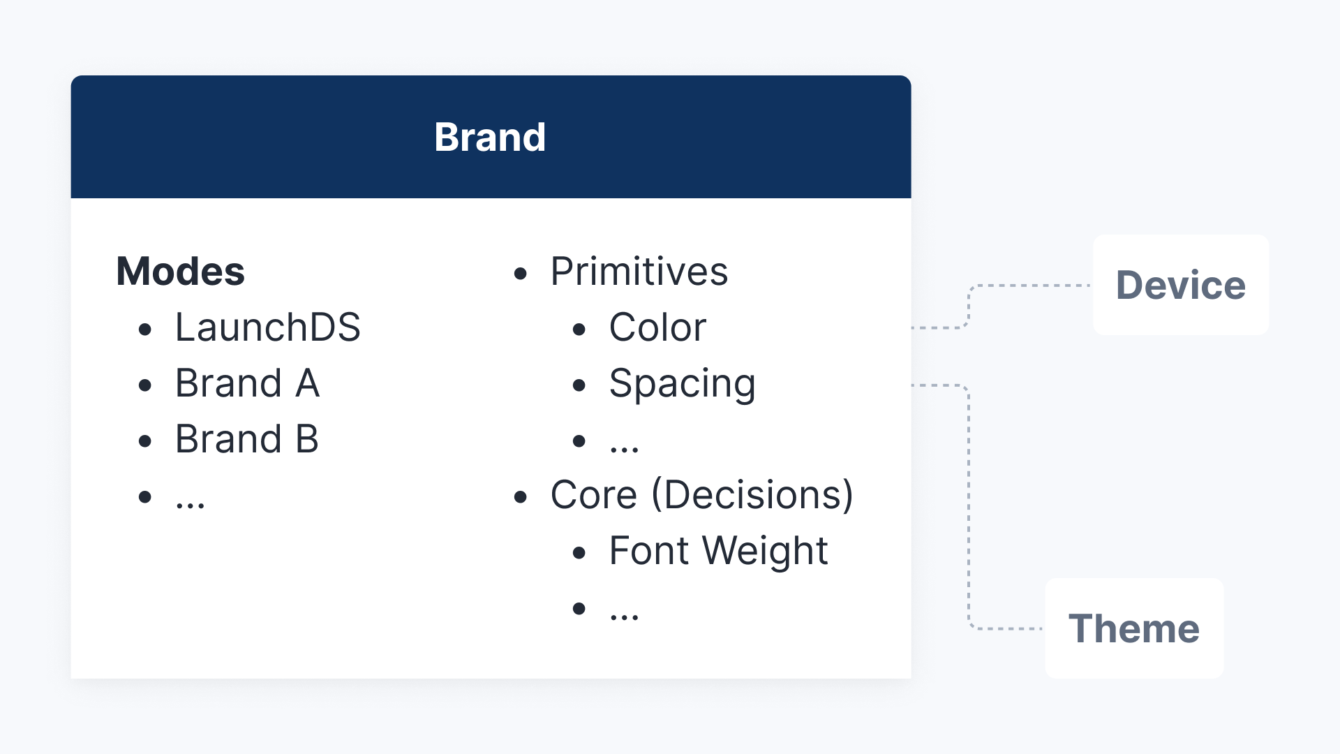
Brand
The Identity Layer. Your source for raw Primitives and semantic decisions. Change your brand's heartbeat instantly without touching the layout.
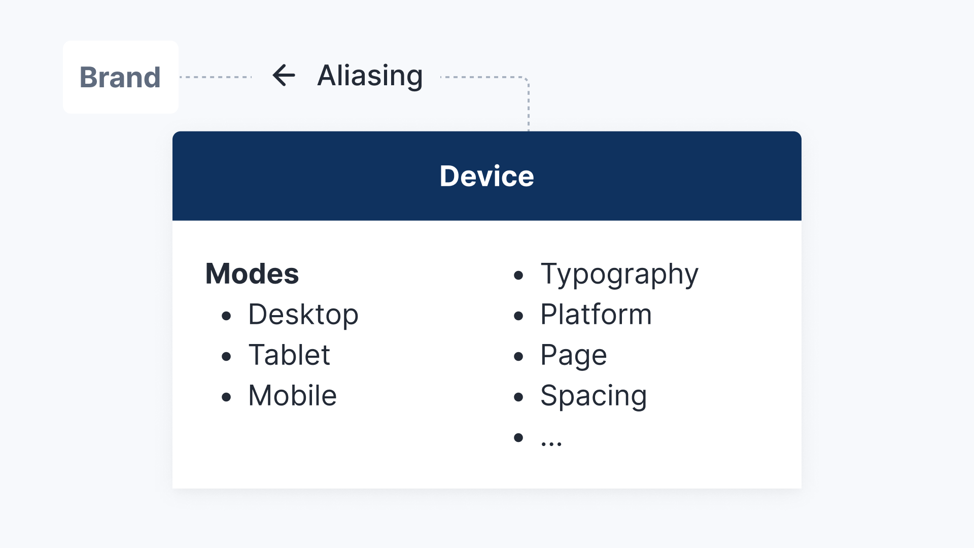
Device
The Responsive Engine. Automatically scales spacing and typography based on the viewport. Your design 'breathes' on desktop and condenses perfectly on mobile.
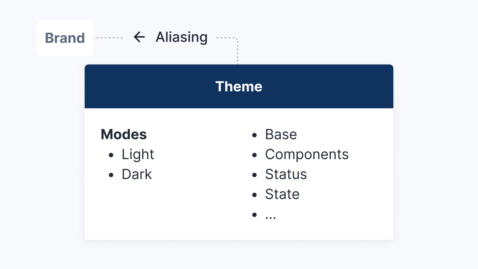
Theme
The Visual Context. A semantic layer for instant environment adaptation. Map functional roles to surface and content colors for seamless light and dark mode switching.
Built for Speed, Engineered for Scale.
From W3C-compliant tokens to fluid layouts. Every feature is designed to eliminate busywork and keep your workflow seamless.

100% Tokenized
Every color, radius, and spacer is a variable. No hardcoded values, just pure logic.

3-Layer Architecture
Decoupled logic for maximum scale: Foundation (Brand), Theme (Context), and Dimensions (Device).

Intelligent Breakpoints
Fluid scaling built-in. Components adapt automatically from mobile to tablet to desktop using dimension tokens.

Semantic Theming
Built with semantic roles (surface, content, action). Switch to dark mode instantly without touching a single layer.

Production-Ready Sections
Includes a library of 50+ fully responsive sections (Heroes, Features, Footers) that inherit your tokens.

W3C Standard Export
Your design system speaks code. Variables are structured to export clean, standard-compliant JSON.

Integrated Iconography
Built on Lucide Icons. Pre-wrapped in a smart utility component. Ensures every icon automatically inherits your size and color tokens.

App Components (Soon)
Expanding the ecosystem. A full library for dashboards and application UIs is currently in development.
Pricing
Save Weeks of Work, Start Today.
Don't build from scratch. Get an expert, tokenized foundation for a one-time investment and focus on what matters: your design.
$
0
- Read-only Figma access
- Full architecture tour
- Token & Variable logic
- Responsive components
- 100% Free to explore
Custom
- Customized project offer
- Full brand integration
- Responsive modes for desktop, tablet and mobile
- Full source files included
- Team training & hand-off


Popular
$
249
- Full .fig master file access
- 300+ Intelligent Variables & Tokens
- Ready-to-use components
- Light & dark mode included
- Desktop, tablet & mobile
Efficiency by Design.
Switch from manual maintenance to instant adaptation. See how LaunchDS turns hours of resizing and rebranding into seconds.
The old way
LaunchDS

Manually resizing for breakpoints

Fluid Scale Tokens
Duplicating screens for dark mode
Instant Variable Modes
Redesigning buttons to change brand
Swap brand mode
40+ hours to setup
Ready in Minutes
Got Questions? We’ve Got Answers.
Everything you need to know about the architecture, licensing, and customization of LaunchDS.
Can I really adapt the system to any brand look?

Absolutely. LaunchDS is structurally agnostic. By simply swapping the Primitives (colors, typography, radii) in the variable panel, the entire system transforms instantly. You can go from a sharp, electric Tech-Brand to a soft, organic Yoga-App in minutes, without touching the layout logic or component structure.
How does the developer handoff work?
Are the pre-built sections rigid templates?
Do I need to be a token expert to use this?
Your Design System is Waiting
Requires Figma (Pro for advanced variable features)
LaunchDS


Foundation
UI Design
UX Design
Wireframing
Prototyping
Colors
Typography
Iconography
Development
Developers
Components
Documentation
Get Started
Accessibility
Changelog
API Status
Resources
Resource Library
Blog
Case Studies
Forum
Support
Privacy Policy
Terms of Service
LaunchDS
Dark Mode
Brand A (soon)
Brand B (soon)
Pricing
Tokenized Design at Scale
The cleanest token-first design system for Figma. Build interfaces with LaunchDS tokens and components to mix and match themes, devices, and brand identities in just a few clicks—while maintaining perfect harmony and consistency. Includes production-ready sections for Figma Sites.
This website is built with LaunchDS & Figma Sites

After working with countless design systems over the years, I distilled my experience into LaunchDS in 2025. It acts as a curated 'best-of' foundation and the ideal starting point for my client projects. The system is not overloaded but includes all relevant components. Every property is controlled by a logical variable architecture, allowing me to easily showcase every screen across different device sizes, themes, and design directions. This creates a workflow flexibility previously unseen in Figma.
David Bühn
Creator of LaunchDS
Components
Essentials for Your Vision
The Core of Your UI. A curated library of versatile components—buttons, inputs, menus, and more. Optimized for speed and consistent user experience.
Tokens
Multi-...Brand
...Device...Theme
One System, Infinite Styles. Setup your Primitives once and effortlessly switch between brands, devices, and themes. Pure logic, no manual overrides.
Sections
Build Stunning Websites in Minutes
Rapid Prototyping to Production. A collection of customizable sections—from Hero modules to FAQ cards. Fully responsive and ready for Figma Sites.
How it works
Token Architecture
This is the nerd part. We don't use hardcoded values. Every component is built on LaunchDS Core, Device, and Theme tokens that alias the raw Primitives directly.
Brand
The Identity Layer. Your source for raw Primitives and semantic decisions. Change your brand's heartbeat instantly without touching the layout.
Device
The Responsive Engine. Automatically scales spacing and typography based on the viewport. Your design 'breathes' on desktop and condenses perfectly on mobile.
Theme
The Visual Context. A semantic layer for instant environment adaptation. Map functional roles to surface and content colors for seamless light and dark mode switching.
Built for Speed, Engineered for Scale.
From W3C-compliant tokens to fluid layouts. Every feature is designed to eliminate busywork and keep your workflow seamless.
100% Tokenized
Every color, radius, and spacer is a variable. No hardcoded values, just pure logic.
3-Layer Architecture
Decoupled logic for maximum scale: Foundation (Brand), Theme (Context), and Dimensions (Device).
Intelligent Breakpoints
Fluid scaling built-in. Components adapt automatically from mobile to tablet to desktop using dimension tokens.
Semantic Theming
Built with semantic roles (surface, content, action). Switch to dark mode instantly without touching a single layer.
Production-Ready Sections
Includes a library of 50+ fully responsive sections (Heroes, Features, Footers) that inherit your tokens.
W3C Standard Export
Your design system speaks code. Variables are structured to export clean, standard-compliant JSON.
Integrated Iconography
Built on Lucide Icons. Pre-wrapped in a smart utility component. Ensures every icon automatically inherits your size and color tokens.
App Components (Soon)
Expanding the ecosystem. A full library for dashboards and application UIs is currently in development.
Pricing
Save Weeks of Work, Start Today.
Don't build from scratch. Get an expert, tokenized foundation for a one-time investment and focus on what matters: your design.
$
0
- Read-only Figma access
- Full architecture tour
- Token & Variable logic
- Responsive components
- 100% Free to explore
Custom
- Customized project offer
- Full brand integration
- Responsive modes for desktop, tablet and mobile
- Full source files included
- Team training & hand-off
Popular
$
249
- Full .fig master file access
- 300+ Intelligent Variables & Tokens
- Ready-to-use components
- Light & dark mode included
- Desktop, tablet & mobile
Efficiency by Design.
Switch from manual maintenance to instant adaptation. See how LaunchDS turns hours of resizing and rebranding into seconds.
The old way
LaunchDS
Manually resizing for breakpoints
Fluid Scale Tokens
Duplicating screens for dark mode
Instant Variable Modes
Redesigning buttons to change brand
Swap brand mode
40+ hours to setup
Ready in Minutes
Got Questions? We’ve Got Answers.
Everything you need to know about the architecture, licensing, and customization of LaunchDS.
Can I really adapt the system to any brand look?
Absolutely. LaunchDS is structurally agnostic. By simply swapping the Primitives (colors, typography, radii) in the variable panel, the entire system transforms instantly. You can go from a sharp, electric Tech-Brand to a soft, organic Yoga-App in minutes, without touching the layout logic or component structure.
How does the developer handoff work?
Are the pre-built sections rigid templates?
Do I need to be a token expert to use this?
Your Design System is Waiting
Requires Figma (Pro for advanced variable features)
LaunchDS
Foundation
UI Design
UX Design
Wireframing
Prototyping
Colors
Typography
Iconography
Development
Developers
Components
Documentation
Get Started
Accessibility
Changelog
API Status
Resources
Resource Library
Blog
Case Studies
Forum
Support
Privacy Policy
Terms of Service
LaunchDS
Dark Mode
Brand A (soon)
Brand B (soon)
Pricing
Tokenized Design at Scale
The cleanest token-first design system for Figma. Build interfaces with LaunchDS tokens and components to mix and match themes, devices, and brand identities in just a few clicks—while maintaining perfect harmony and consistency. Includes production-ready sections for Figma Sites.
This website is built with LaunchDS & Figma Sites

After working with countless design systems over the years, I distilled my experience into LaunchDS in 2025. It acts as a curated 'best-of' foundation and the ideal starting point for my client projects. The system is not overloaded but includes all relevant components. Every property is controlled by a logical variable architecture, allowing me to easily showcase every screen across different device sizes, themes, and design directions. This creates a workflow flexibility previously unseen in Figma.
David Bühn
Creator of LaunchDS
Components
Essentials for Your Vision
The Core of Your UI. A curated library of versatile components—buttons, inputs, menus, and more. Optimized for speed and consistent user experience.
Tokens
Multi-...Brand
...Device...Theme
One System, Infinite Styles. Setup your Primitives once and effortlessly switch between brands, devices, and themes. Pure logic, no manual overrides.
Sections
Build Stunning Websites in Minutes
Rapid Prototyping to Production. A collection of customizable sections—from Hero modules to FAQ cards. Fully responsive and ready for Figma Sites.
How it works
Token Architecture
This is the nerd part. We don't use hardcoded values. Every component is built on LaunchDS Core, Device, and Theme tokens that alias the raw Primitives directly.
Brand
The Identity Layer. Your source for raw Primitives and semantic decisions. Change your brand's heartbeat instantly without touching the layout.
Device
The Responsive Engine. Automatically scales spacing and typography based on the viewport. Your design 'breathes' on desktop and condenses perfectly on mobile.
Theme
The Visual Context. A semantic layer for instant environment adaptation. Map functional roles to surface and content colors for seamless light and dark mode switching.
Built for Speed, Engineered for Scale.
From W3C-compliant tokens to fluid layouts. Every feature is designed to eliminate busywork and keep your workflow seamless.
100% Tokenized
Every color, radius, and spacer is a variable. No hardcoded values, just pure logic.
3-Layer Architecture
Decoupled logic for maximum scale: Foundation (Brand), Theme (Context), and Dimensions (Device).
Intelligent Breakpoints
Fluid scaling built-in. Components adapt automatically from mobile to tablet to desktop using dimension tokens.
Semantic Theming
Built with semantic roles (surface, content, action). Switch to dark mode instantly without touching a single layer.
Production-Ready Sections
Includes a library of 50+ fully responsive sections (Heroes, Features, Footers) that inherit your tokens.
W3C Standard Export
Your design system speaks code. Variables are structured to export clean, standard-compliant JSON.
Integrated Iconography
Built on Lucide Icons. Pre-wrapped in a smart utility component. Ensures every icon automatically inherits your size and color tokens.
App Components (Soon)
Expanding the ecosystem. A full library for dashboards and application UIs is currently in development.
Pricing
Save Weeks of Work, Start Today.
Don't build from scratch. Get an expert, tokenized foundation for a one-time investment and focus on what matters: your design.
$
0
- Read-only Figma access
- Full architecture tour
- Token & Variable logic
- Responsive components
- 100% Free to explore
Custom
- Customized project offer
- Full brand integration
- Tailored screens & prototypes
- Full source files included
- Team training & hand-off
Popular
$
249
- Full .fig master file access
- 300+ Intelligent Variables & Tokens
- Ready-to-use components
- Light & dark mode included
- Desktop, tablet & mobile
Efficiency by Design.
Switch from manual maintenance to instant adaptation. See how LaunchDS turns hours of resizing and rebranding into seconds.
The old way
LaunchDS
Manually resizing for breakpoints
Fluid Scale Tokens
Duplicating screens for dark mode
Instant Variable Modes
Redesigning buttons to change brand
Swap brand mode
40+ hours to setup
Ready in Minutes
Got Questions? We’ve Got Answers.
Everything you need to know about the architecture, licensing, and customization of LaunchDS.
Can I really adapt the system to any brand look?
Absolutely. LaunchDS is structurally agnostic. By simply swapping the Primitives (colors, typography, radii) in the variable panel, the entire system transforms instantly. You can go from a sharp, electric Tech-Brand to a soft, organic Yoga-App in minutes, without touching the layout logic or component structure.
How does the developer handoff work?
Are the pre-built sections rigid templates?
Do I need to be a token expert to use this?
Your Design System is Waiting
Requires Figma (Pro for advanced variable features)
LaunchDS
Foundation
UI Design
UX Design
Wireframing
Prototyping
Colors
Typography
Iconography
Development
Developers
Components
Documentation
Get Started
Accessibility
Changelog
API Status
Resources
Resource Library
Blog
Case Studies
Forum
Support
Privacy Policy
Terms of Service